

Their reputation is self-described as one based on their “ability to constantly reinvent their resources as well as those of their clients, so as to unlock growth through transformational thinking”. At a brand identity level, they have chosen to express this as “Organic Reinvention”.
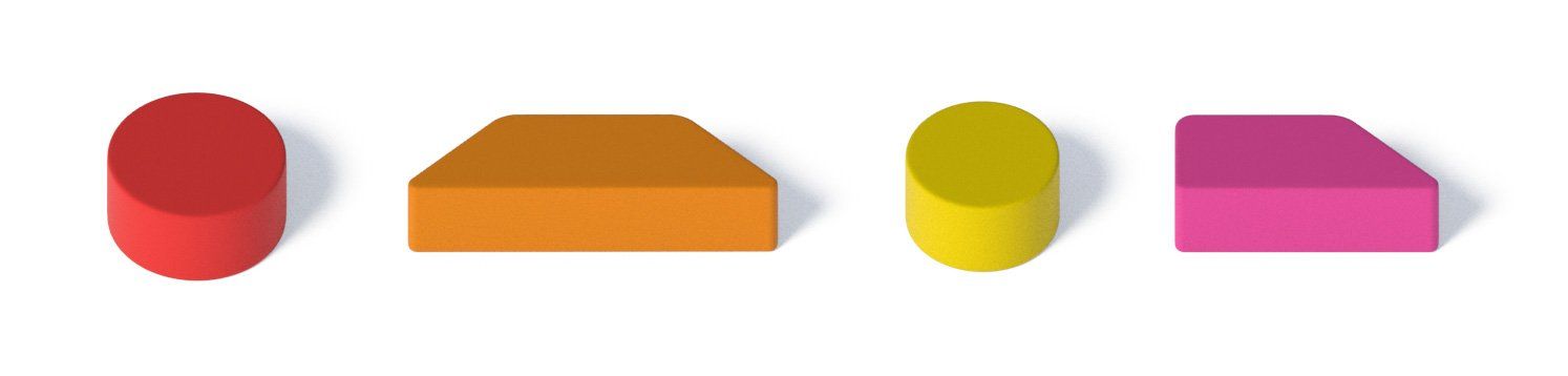
Visually this comes to life through three simple 3-D shapes that can be recombined, restructured and ‘reinvented’ into an infinite number of recognisable shapes.
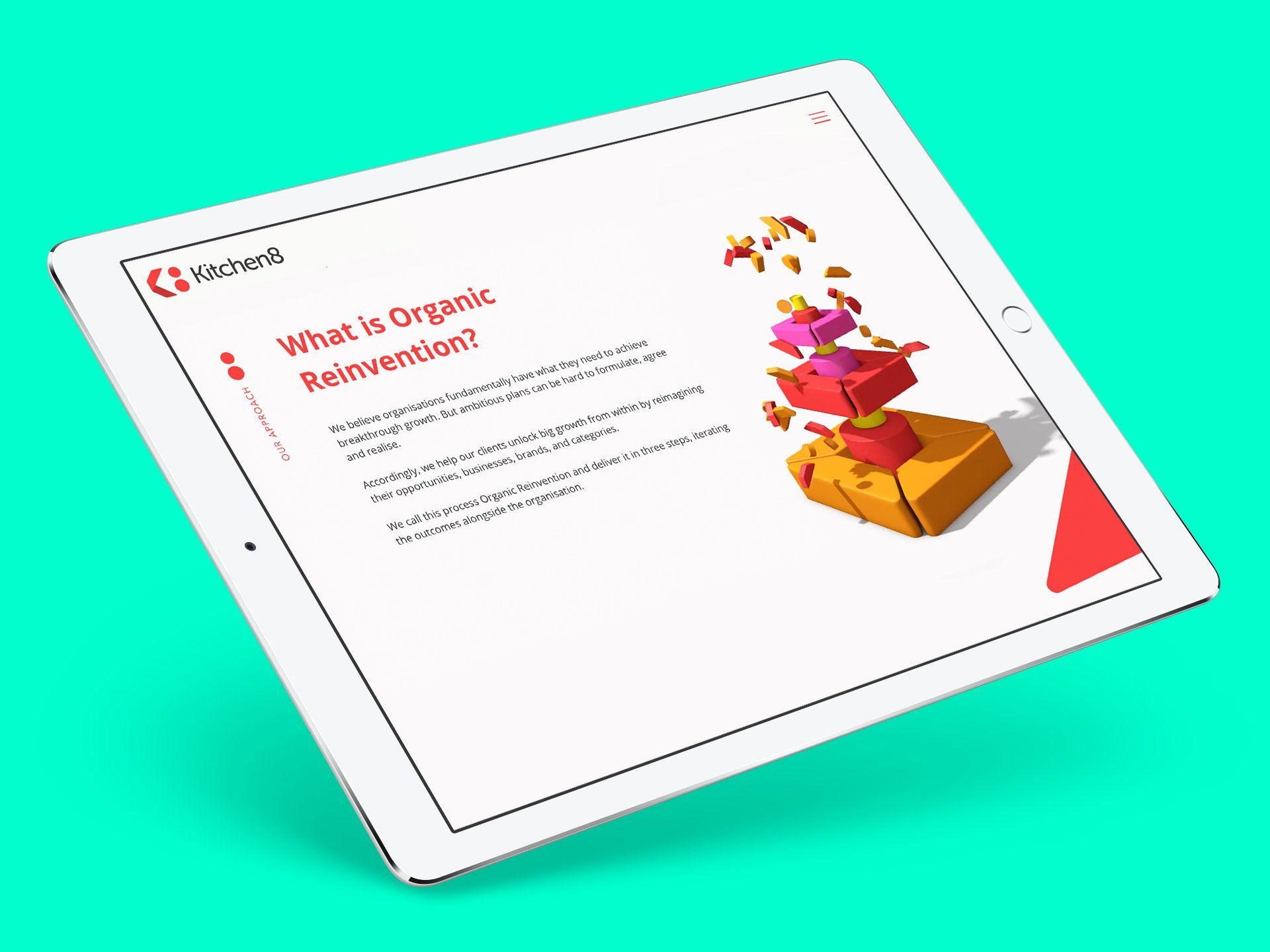
Taking a cue from the brand’s ‘building blocks’, our primary approach was to introduce a visual fluidity that mirrored the idea of “Organic Reinvention”.
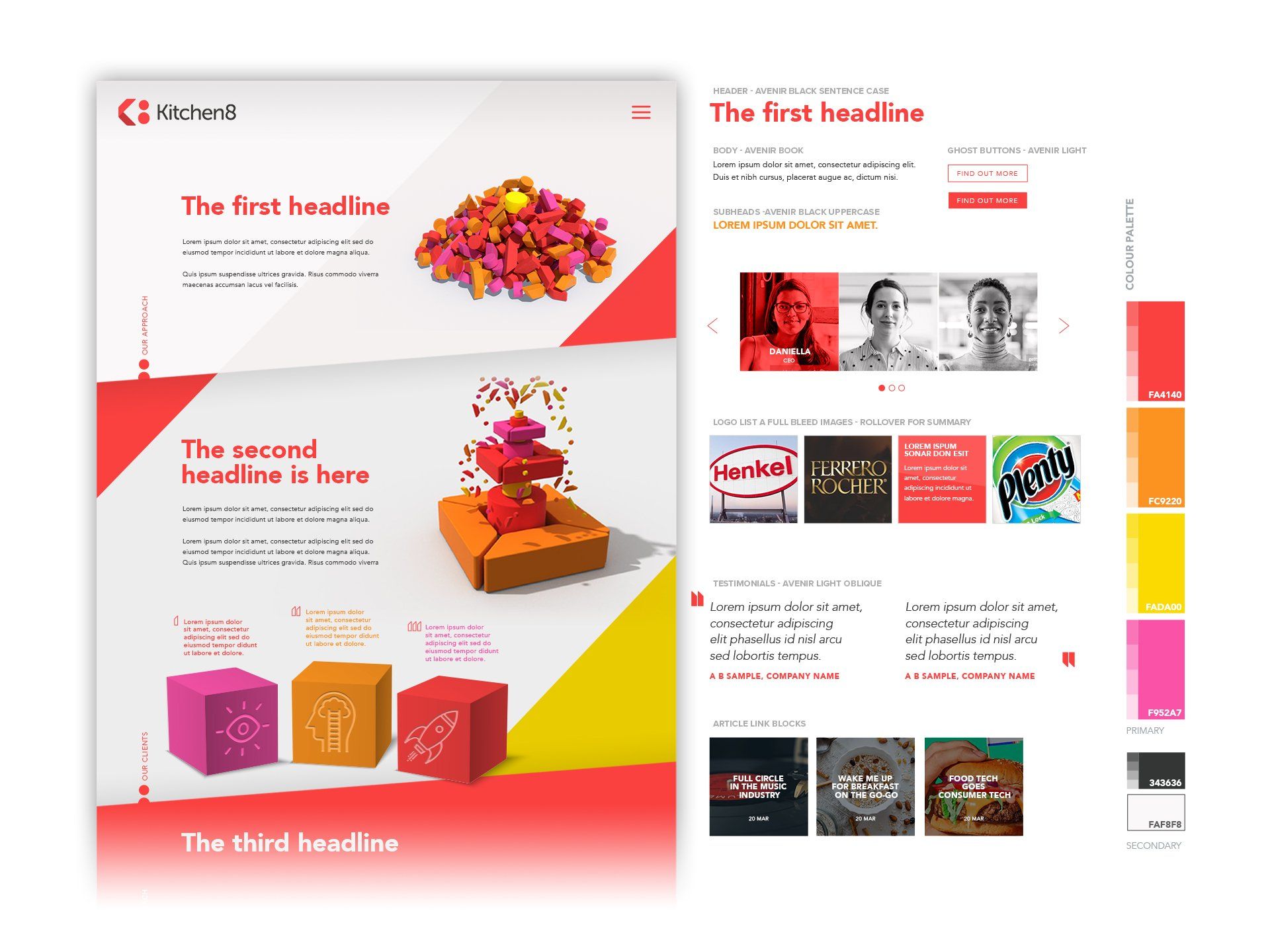
So, one of our first design decisions was to build a site on a single, seamless page. Our intention was to maintain a sense of connectivity that felt alive and fluid.
To add further life and flow to the site, we also created a series of animations using Kitchen8’s brand shapes.
Finally, in-between the beauty and elegance of the design, we also ensured that the backend was easy for the Kitchen8 team to regularly update with new content.
© 2025 Animo Group Limited. All rights reserved.